Final POSTER for my short! (opinions please)/ Posters for cheap offer...

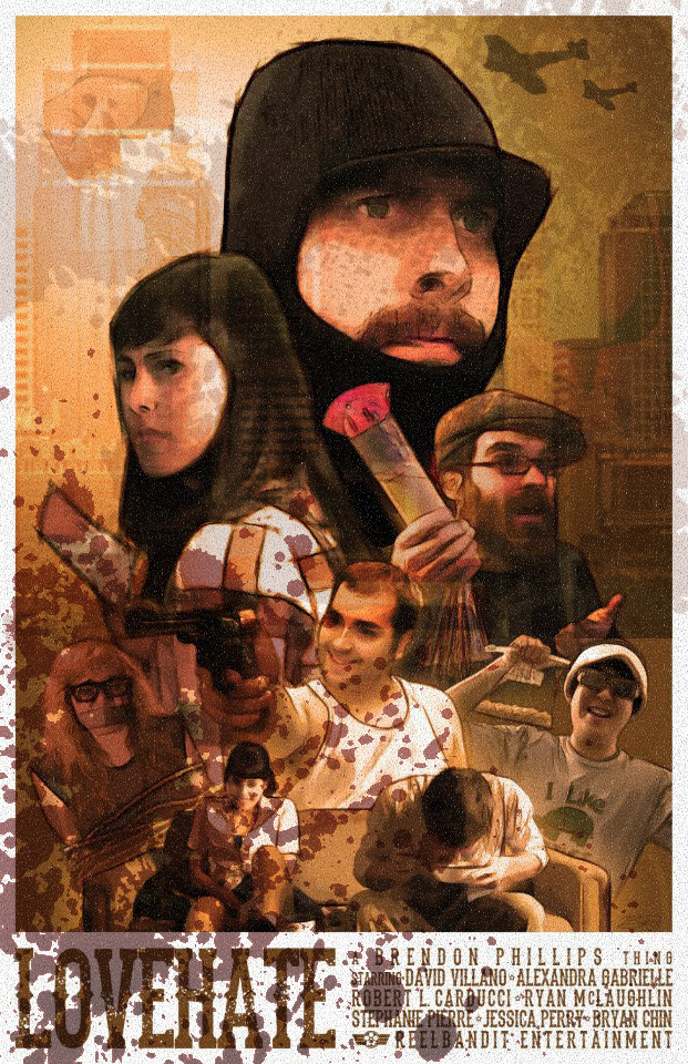
Hey guys, so I'm pretty stoked...I just finally completed a short film I've been working on for about 2 years (ugh yeah i know...)... I just finished my poster design for the film which I consider in the genre of "comedy adventure" ... please please please check it out and let me know what you all think...

also...if you like it and happen to need a poster done for your projects, feel free to email me at Brendonphillips@gmail.com ...I love making posters and understand the average low/no budget filmmakers NEED for good promo material on a tight budget, so I'm willing to be flexible with rates... either way if you dig it, hit me up!

https://www.facebook.com/photo.php?fbid=628211668774&set=a.628210640834.2068363.215300912&type=1&theater
 
480889_628211668774_36405032_n.jpg


Thought id post it up for everyone to see, your less likely to get someone to click on your link.

also i kinda like it, reminds me of borderlands game
 
THANKS DUDE! ... its mostly hand drawn, then colored in photoshop... few cheats here and there of course...original concept was more for the indy "struzan" look... not sure if i pulled it off or not, but either way im happy with it!
 
It's kind of old school, but I mean that in a good way. I rather like that. I'd totally put that on a wall, if I had a wall not dominated by my wife's artwork (Guess who gets to do MY posters, if and when I need them... Heh.)

Reminds me of late 60's, early 70's posters I've seen, but like I said, the good ones.
 
Very nice. I can see the Struzan influences. If you want to get more of that old school feel to it, draw up some borders on it and put your title on the top in a logo'd style.
 
Thanks guys, REALLY appreciate it...was going (hopefully obviously) for the struzan look, but didn't want to really push that in the original description (in case it didnt come off at ALL like that to others) ... glad ya guys dig it!
 
I like it. The images in the background are too faded for my taste. Not everyone will notice them.
Overall it's too smooth and polished. Maybe add some dirt and contrast, some grain etc.
I did this in 2 minutes sorry about that it has nothing to do with your movie just random stuff to explain what I mean...

j4hIXXF.jpg
 
lol at first glance I was like W.T.F. ... but I get what your saying! I actually have a few different versions on my computer... some have grittier textures on them... the version I have posted here was actually the "print" version... after some experimentation I realized the clean polished poster looks way better when physically printed (as the paper itself adds texture), but on a computer screen the fake textures totally add to it. thanks for input!
 
Back
Top