• Wondering which camera, gear, computer, or software to buy? Ask in our Gear Guide.

Lighting Comparison

I'm very new to lighting, and I just bought a few clamp lights after watching some 3 point lighting tutorials and started experimenting a bit. Below is 4 different setups I tried, I just wanted to know which one you think looked the best, or most cinematic. I know, none of them are very good, but this is my first attempt. Ever.

lightingcomparison1.jpg


Thanks!
 
Remember that you don't necessarily have to point your lights at your subject - you can bounce them off walls, ceilings etc. to get some interesting lighting setups. Reflectors come in handy for manipulating light too.
 
My fall back lighting is always set the backlight and key on opposite sides of the subject (left/right) with the back light in back and the key in front... I then fill the side opposite the key to flavor. For light levels, the key is set as the main exposure light, so it's as bright as it needs to be for me to achieve the f-stop I want, then I like the backlight to be 1 to 1.5 times as bright, then the fill on a dimmer to be able to dial in the contrast that "feels" right to me.

I then light the background at a really shallow angle to give it texture and walk away... this covers 70% of my lighting setups.

I either use motivated light for the backlight or the key... in your case, the motivation is that window in the background which can be the backlight in this case... you'll then key up to that (since you have no control over it at this point).
 
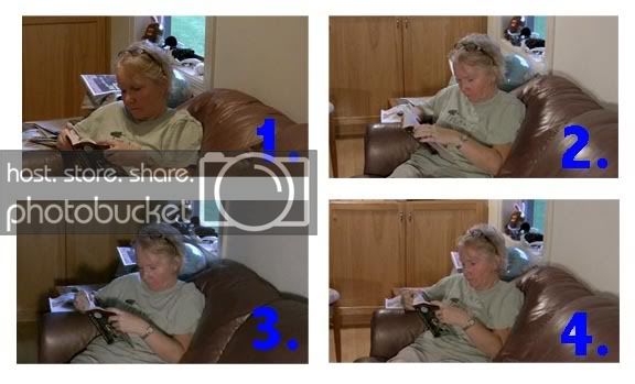
Nice attempts and it's always a good idea to play around with your lighting set-ups for your desired outcome. I like 1 most because it looks more natural and most importantly the lighting does not bring attention to itself which is key (no pun intended) to good lighting.

Consider this, in a three point lighting set-up your key (source) light is the strongest light in the setup and is motivated by something - in this case, without being privy to the whole scene, I would say it's the window behind her. So that is the motivation for the key light placement. Your fill (which could be a light or a bounce card) will be on the other side of the key and it's job is to fill some of the shadows created by the key - some of the hard shadows that are naturally caused in eye-sockets, the other side of the nose, throat, etc.) Then you have your rim or back light that helps separate the subject/object from the background - to define/create depth in the frame.

So that's why I like 1 because...

a) the key seems to be the right place and does not bring attention to itself.

b) The fill seems a tad bit forced but like I said I cannot see the whole scene so maybe there is a practical (lamp, small window or some other light source) that motivates the use of an actual light as as fill, otherwise, a simple bounce card would have done the same thing without calling attention to itself. Which brings us to...

c) The rim light. This is a tricky one for a few reasons. First, the angle of the shot and the fact that the subject is already sitting with her back almost directly towards the strong light source (the window) do you really need another light for separation? I am not judging just asking the questions you should be asking yourself when you set up the scene. Also, this is the part many get wrong in lighting - be very careful when back lighting blonds or people with white and silver hair. Their hair is already bright and adding light to that could cause exposure problems (especially on close ups). So like Aegis said, in the cases where you need to create separation between a subject with blond/silver/gray hair you could bounce light off of the background or something. While on this topic, when rim lighting a bald subject you may want to do some tricks like spray an aerosol deodorant or something to take a bit off the shine from the top (to deal with the potential exposure problems). Finally, broaden your creative considerations and start thinking about set design. I like the general angle of the shot and I know it's a test but you could do more with the composition. But nothing pops for me in these shots because of the overpowering Earth tones all over the place. Everything is in some shade of brown which is drowning you subject. There are more considerations to lighting a scene and what you are lighting should be one of them.

You could have lit this scene with only one light and perhaps a bounce card. That's why when people start talking about three point lighting it's most important to understand that it's a matter of concept more so than actually having three physical lights.

I also need to address one more tid-bit, you used the word "cinematic" and I am not sure where you were going with that. If you were in fact looking for a dramatic look then you would be talking about a lo-key type setting where you're source (key) light would be more pronounced thereby creating contrasting shadows (how deep is based on the look you are going for or what your story demands) on the fill side. Or your could be going for no contrast (affinity) at all and the scene is either evenly or close to being evenly lit (with little to no shadows) - a technique employed in comedies. Either way both looks can be considered as "cinematic".

To wrap things up, try picking up a copy of "Placing Shadows, Lighting Techniques for Video Production" Third Edition by Chuck Gloman and Tom Letourneau. It was a great primer for me from a lighting POV.

Nice effort. Keep up the good work.
 
In that shot, Due to the window's location in relation to the subject, I'd personally call it the rimlight rather than the key... I'd consider using an incandescent light as a key on the opposite side of the subject but in front because the face and eyes are the important part of the subject that we want to see. The motivation would be implied interior lighting in this case.

I've done lighting tests with the key on the same/opposite side and varying degrees of contrast and I personally like the aesthetic I'm describing as it helps separate the subject from the background. putting the camera slightly on the fill side makes really strong texture/light modeling as well by "Short Lighting" the subject.
 
Sounds like a cool set-up, knightly, I kind'a like it. Seems like a cool way to mix lights of different temperatures - the cool blue from the window and the warmer color from a tungsten that is motivated by an implied lamp. I know mixing different light temperatures takes some skill and consideration, but if pulled off it could make for something impressive. I like that and will consider that in future set-ups. Thanks.

The point of my blurb (and I hope I made it clearly, as I did touch on a few things) was to bring to the OP's attention some of the things to consider when designing their lighting for a targeted effect. I also put that stuff out there so that other viewers will start looking at the three point lighting as a concept that factors into proper lighting design and not necessarily the formulaic positioning of three lamps.
 
...will start looking at the three point lighting as a concept that factors into proper lighting design and not necessarily the formulaic positioning of three lamps.

Absolutely, this is my aesthetic from which I start, not always my destination... If I have enough light on the background, I don't always rimlight the subject as there's enough separation from the background... I do tend toward short lighting almost always, I just think it's more flattering for my actors (and they're currently working for free, so I like to try to get them footage they can put on their reels to make them look as good as possible). Here's some examples:

Picture 17.jpg
 
No problem. The two that are most like the ones from the OP are: Pictures 3 and 12. They very specifically use the sunlight from a window as a rim light and are lit with incandescents from the opposite side.

As you can see, I love having a contrasty image more often than not. I get that by placing the camera so that it can see the non-key side of the face (in varying degrees depending on the mood I'm going for). Once you move the camera past the middle line in the lighting over to the darker fill side, it's called "Short lighting" and works to slim people's faces... camera on the key side is called "Broad Lighting".

I love that the OP is taking the time to do lighting tests though, it's necessary to the learning process. One of the ways I like to do it is very systematically... Set the camera and a key light on opposite sides of the subject and then slowly rotate the key around the subject at the same distance from them to see how the angle in relation to the camera affects the image (Move it a few feet each time). Then soften the light and repeat... then do the same with the rimlight/backlight. I like a hard short key, a soft rimlight that's just hinted at and a soft fill that brings up the shadows just into an acceptable range.

I light using a reduced version of the zone system with only 3 zones (to match what I'll have control over in my 3-way color corrector in post). I make sure I have visible darks, well exposed mids and controlled highlights that I can color, push and pull in Final Cut later.
 
So having said all that, I think 2 and 3 have the most promise to my eye, the camera needs to be moved to the left a bit to show the transition from light to dark on the subject's face.
 
Lighting: I can't add to what has been said. Great job guys!

Shot composition: You've got the right idea with the angles you picked. They give the shot depth (i.e. not just her sitting on the couch with the flat wall perpendicular to the camera). Just one thing drove me crazy: you need to get your subject out of the center of the frame. It's best to use the rule of thirds, like in painting or photography. :)
 
Back
Top