
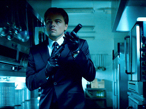
I really like the blue lighting in some Inception scenes (and TDK as well). How did they do it?
I'm no DoP, but I guessed they used tungsten lighting and some type of gel. Maybe something in post? What do you think?
I'm no DoP, but I guessed they used tungsten lighting and some type of gel. Maybe something in post? What do you think?

")