• READ BEFORE POSTING!
    • If posting a video, please post HERE, unless it is a video as part of an advertisement and then post it in this section.
    • If replying to threads please remember this is the Promotion area and the person posting may not be open to feedback.

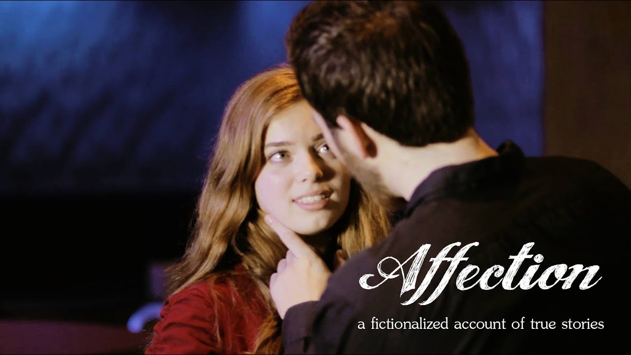
watch Affection (2016) [Student Film, Drama/Romance]

Watch Tufts University Television's first feature film, Affection, and let us know what you think!

https://www.youtube.com/watch?v=xviY-BEF1lI

maxresdefault.jpg
 
I'm gonna have to pause it there and share some thoughts, because I am currently 10 minutes in, and so far 80% of this film has been spent endlessly watching Facebook texts appear on screen, while partly watching a girl (nearly) motionlessly sit on her bed typing away. And it is getting increasingly harder and harder to view, as it feels like we're getting nowhere fast.

Mind you, I am following the unfolding information between Ibby and Isaiah just fine. The problem is that the filmmakers here have failed to engage me visually on any level (which is half the point of this medium), which has made it incredibly difficult to stick around and follow how this story develops.

First of all, director Phoebe Cavise has chosen to go with a Facebook message overlay gimmick, which has been around at least since Facebook was in its second year: or since the BBC show Sherlock made it a popular visual. I am referring to the visual gimmick of having the posts appear on screen as they happen for us to read, sometimes floating above phones or laptops as they move about the screen. However, she has included no form of motion graphics in order to make these messages appear and disappear in an interesting way: perhaps with some bounce and energy. Although in spite of that, either she or her vfx editor have also failed to present them in a realistic way: with timing that represents how real people would read, interpret, comprehend, and respond to such posts; thus making the posts impossible to follow in a few cases without pausing the film, lest they disappear before I can finish reading them. Which I'm sure you understand is impossible to do in a theatrical setting.

Furthermore, the posts presented in the opening credits look as if they were simply centered up on screen and then cut between like a series of images, when a much better choice would have been to lay them out vertically as they had done just 5 minutes later, and have them slowly fade-in one by one. This would have given the audience a chance to read them, and actually anticipate the next in line in the sequence: which would have engaged the audience much more readily than having them bamf in every few seconds.

I am also unsure as to why there is no narration in the beginning, yet there is once Ibby is sitting on the bed typing in real-time. Wouldn't it have been acceptable to leave out narration both times, or include it both times? Why do one and then the other?

I can certainly see the benefit of adding narration only later, due to the static nature of that later scene on the bed. The voice-over reading of the texts helps to add an extra bit of emotional delivery where very little exists on its own. But this would be easily alleviated by changing up the camera, and showing us some necessary close-ups of our actress here. I mean, why is this whole scene almost entirely shot from one static angle with Ibby bunched up against the right side of frame? How was this a good shot design choice? Why not pull the camera back some to give us more room? Why not punch in on her face for some genuine facial reaction in the eyes and lips to what Isaiah is saying to her? Why can't we see this from her perspective, OTS style, as she types in a message and gets the next from him? There were plenty of options Ms. Cavice could have gone with here.

But I suppose the most unusual thing of all is that Phoebe chose to do no color grading to this film, despite every single shot being both pale and de-saturated.

Was this exclusion of a grade intentional? Or is the film not entirely finished? Because I think this film would look vastly better were it to have a color grade based on greeting cards or something like that: something with soft pinks, yellow-oranges, baby blues, and other soft colors, but with just enough contrast and saturation that it also doesn't look completely washed out.

I shall continue to watch the film, as I don't wish to judge it completely by this first fifth. But I must stress that we are not off to a good start.
 
Last edited:
Now that I've watched the whole film, I can really pick up on how relatively well the conversations between Isaiah and Ibby have been written out.

I know friends, and even I have had conversations that, while not of the same type or situation, have led to similarly awkward reactions and similar responses as Affection presents here. So I think that aspect of this story was planned out well.

But my critiques from my last post still remain very much an issue throughout the rest of the film. The constant usage of overlayed Facebook text boxes, the computer screen itself, and really all of these long scenes of typing and reading and typing and reading really don't have much that draws me in and keeps me engaged visually. In fact, I'd have an easier time just listening to the audio track with my eyes closed than watching what was filmed to go along with it. The biggest absence being a choice of camera angles beyond these stable static long takes, which could put me in different perspectives that might hopefully reflect the changing emotions of our lead actress. Or to put it more clearly, each camera angle would represent an emotional change in Ibby as she reads and responds, thus helping us to pick up on that emotional change as an audience. What if we were to get closer to her? What if the camera pulled up along side her in a profile shot? What if the camera pulled back to make her look or feel smaller? What if the camera got up behind her and looked over her shoulder? All of these would have been great options to try and include here.

The bigger issue, though, has to be the text and the knock-off Facebook graphics. It was wise of the filmmakers to recreate the Facebook messaging page in order to avoid trademark issues with that (despite not blurring out or excluding the Linus T-shirt that Isaiah wore later). But the choice of font, the lack of pixelization, and the lack of any unique graphical iconography made all of these extended messaging scenes feel flat, drab, and uninteresting. They look like they only took a few days to make when there should have been some amount of design process that occurred before someone started composing them for the film.

Similarly, while I don't mind this film using the date and time-code of this fake Facebook messenger as a transitional time-card to show that time has passed; again, I wish these would have been framed up in a more realistic way, and with a more accurate pixelated form of font that would look more familiar to the eye. They could have even had the text fade in over a black screen and then fade out. Or they could have kept the white screen, but made the text pop up with a bouncy movement, and then cut back to the conversation. Just something that didn't simply appear on a hard cut and then cut away again.

Hard cuts are not always the best answer.

All in all, I do think I sincerely felt for Ibby here, and I really grew to hate Isaiah, which I'm sure was the point. The story was generally sound and well-conceived, especially since Tufts University claims it was based on real events. And Ms. Cavice's chosen style of execution for this story was a bold one, although these days not entirely unique.

Again, it was the visuals that proved the biggest problem area. But thankfully, every visual issue I've expressed regarding the text boxes and messaging screens can be improved to the point where the film could be twice as good as it is now if done so. And I would highly recommend going back and revising them in the near future.

Thanks very much for sharing this.
 
Last edited:
Back
Top