A lot of the look will also be framing, composition and camera movement.
Movies from the 80s and 90s weren't so in to the whole "handheld" look like a lot of movies today.
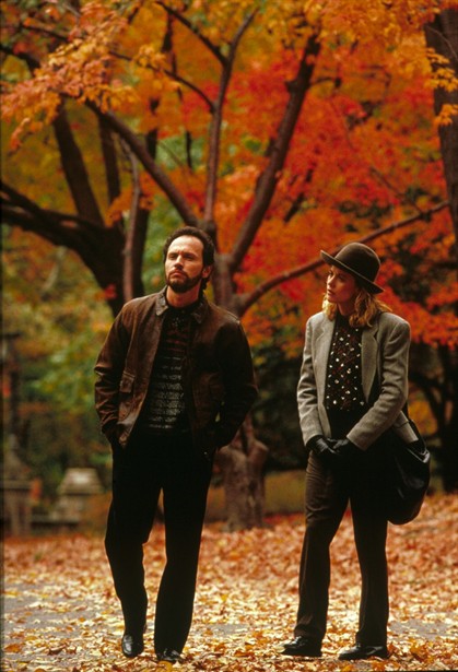
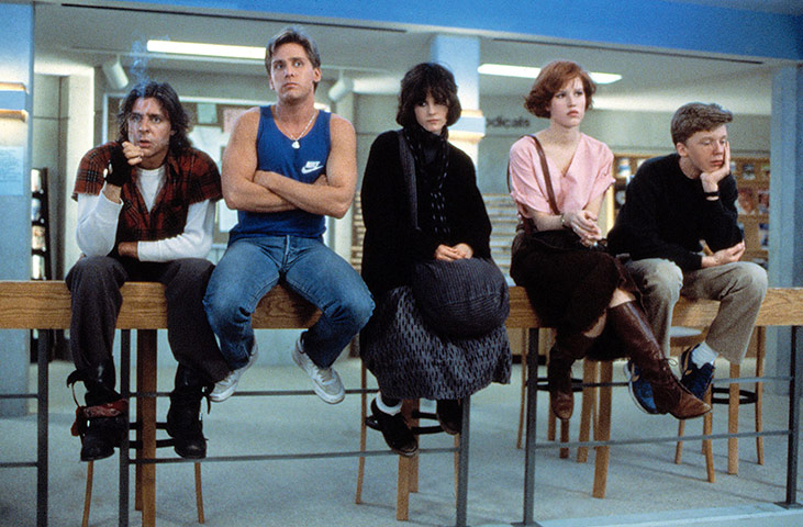
Another is the lack of heavy color grading. Back in the day, if the people making the movie wanted a scene to look a certain way, it had to be done with lighting. Everything was exposed and adjusted for in-camera to get the best natural colors. Probably why "The Breakfast Club" looks a little "flat" compared to today's movies.
Heavy color grading came around in the mid 90s, when digital was taking the industry by storm and filmmakers realized they could change colors in post to evoke certain feelings. Prime example is The Matrix! Look at how green it is!
So, if you want to make your movies look like they're from the 80s and early 90s, you'll need to focus on getting as natural of color as possible in-camera, not really boosting the saturation in post at all (that SCREAMS digital video!), and maybe only adjusting contrast slightly in post.
Another you can do, after everything's edited and adjusted to your liking, is add some slight film grain and a VERY subtle "jitter" effect - this will help emulate the grainy look of film, and the jitter will add that "running through a projector" feel. BUT REMEMBER! - subtlety is KEY.
Here's a video showing what I mean. I made it to look like it's on an old VHS tape, but you can see what I mean by slight jitter and grain (although I feel it's still a little heavy on the grain/jitter in some instances).
It was all done in Sony Vega Movie Studio, but you can do it in most editors that have noise and "bad TV" filters. Really simple in theory, but in practice it shows to be a bit tough.
 https://vimeo.com/22094042